Framework7 v5
Major Framework7 update has been arrived 🎉!
In this post we will look at what is new in v5.
Framework7 Lite
Core Framework7 package now contains new so called -lite JavaScript files. "Lite" version is basically the same as usual one, but with one difference - it doesn't contain Router Component functionality and its related features (Virtual Dom, routes with componentUrl, etc.).
This "lite" version is designed to be used with Framework7-React and Framework7-Vue libraries, where you, anyway, use React or Vue components instead, so switching to "lite" version will save extra KB in F7-React/Vue apps.
import Framework7 from 'framework7/framework7-lite.esm.js';
import Framework7Vue from 'framework7-vue';
Framework7.use(Framework7Vue);
Check updated Package Structure docs for full reference of new files.
CSS and Theming
There are many CSS and theming tweaks and fixes:
- iOS dark theme colors reworked to match iOS 13 dark theme colors
- Most of CSS variables related to colors (especially "gray" colors) reworked to
rgbacolors to appear better on custom designs. It is related to text colors, background colors, icons colors, borders and hairlines colors. - Most of iOS theme
15pxsizes (list/blocks paddings and margins) are changed to16pxinstead - Dark theme can now be excluded from bundle (custom build)
- And light (default) theme can also be excluded from bundle (custom build)
New Responsive Breakpoints
There are new system CSS responsive breakpoints. This can be a breaking change.
If you remember in previous version we had helper classed like tablet-inset to make list block inset on tablet-size screen, or tablet-50 to make grid column 50% width on tablet-size screen.
Nowadays this became irrelevant, so v5 has new set of such responsive breakpoints:
They are now:
xsmall- width more than 480pxsmall- width more than 568pxmedium- width more than 768pxlarge- width more than 1024pxxlarge- width more than 1200px
So, if we want to make List block inset on tablet screens, now we need to add medium-inset class to it.
Same for Grid. Now we have more control on column sizes:
<div class="row">
  <div class="col-100 small-66 medium-50 large-25 xlarge-15">...</div>
  ...
</div>
Same for Data Table, we can have more controls on which cells to show on different screen sizes:
<tr>
  <td>...</td>
  <td>...</td>
  <!-- show cell when screen width >= 768px -->
  <td class="medium-only">...</td>
  <!-- show cell when screen width >= 1024px -->
  <td class="large-only">...</td>
</tr>
iOS Translucent Bars & Modals
Framework7 v5 now supports translucent navigation bars (Navbar, Toolbar, Subnavbar, etc.) and modals (Dialog, Actions) for iOS theme and iOS devices from the box. And this is enabled by default.
This can be a breaking change if you have custom bars colors, because in "translucent mode" it uses other CSS variables for that. So you can disable translucent bars and modals by disabling iosTranslucentBars and iosTranslucentModals app parameters.
var app = new Framework7({
  iosTranslucentBars: false,
  iosTranslucentModals: false,
});
New Navbar Layout
This can be a breaking change, or at least if you don't update it, it will look broken.
In v5 Navbar container must have new navbar-bg element that should be placed before navbar-inner, and new layout looks like:
<div class="navbar">
  <!-- new required navbar-bg element -->
  <div class="navbar-bg"></div>

  <div class="navbar-inner">
    <!-- ... -->
  </div>
</div>
Large Navbar (Navbar with large title) now should be enabled by adding navbar-large class to Navbar element:
<!-- new navbar-large class for navbar with large title -->
<div class="navbar navbar-large">
  <div class="navbar-bg"></div>
  <div class="navbar-inner">
    <!-- ... -->
    <div class="title-large">...</div>
  </div>
</div>
Also, iOS theme' dynamic Navbar behavior has been totally reworked. Now it doesn't take navbar-inner from the page's Navbar, but takes whole Navbar element. It makes it easier to customize each navbar (background color, text color, hairlines (borders), shadows) and such behavior brings better transitions between them.
Large Transparent Navbar
There is new "transparent" modification of Large Navbar. It makes Navbar and its behavior similar to what we have in Apple's native apps in iOS 13.
To make large title transparent we need to add navbar-large-transparent class to large Navbar:
<!-- add navbar-large-transparent class -->
<div class="navbar navbar-large navbar-large-transparent">
  <div class="navbar-bg"></div>
  <div class="navbar-inner">
    <!-- ... -->
    <div class="title-large">...</div>
  </div>
</div>
Reworked "Statusbar" Layout
Statusbar overlay element (<div class="statusbar">) and related functionality has been removed in favour of using that space by navigation bars and other elements to provide true full-screen experience and better customization.
Statusbar Cordova's API is there as it was before.
Improved Calendar
Calendar got major improvements. Now it uses ECMAScript Internationalization API, specifically Intl.DateTimeFormat (for date/time format, month names, day names, etc.).
Also, it has new features:
- New month picker functionality (clicking month name in toolbar will open month picker)
- New year picker functionality (clicking year in toolbar will open year picker)
- New time picker functionality (to select a time in addition to date)
Check updated Calendar Docs and demo video below that is using system-related date-time format with month, year and time pickers:
New Text Editor Component
Framework7 v5 comes with a new touch-friendly Rich Text Editor component. It is based on modern "contenteditable" API so it should work everywhere as is.
It comes with the basic set of formatting features. But its functionality can be easily extended and customized to fit any requirements.
Push Popup
There is a new "Push" Popup behavior. On open it will push View (or Views) behind. To enable it we just need to pass push:true to Popup parameters or by adding a popup-push class to Popup element.
This feature works only when top safe area is in place (e.g. when safe-area-inset-top is more than 0). For example, when it is a full-screen iOS Cordova app or iOS app installed to home screen.
Also, it is possible to enable it on components that use Popup as a content opener. In components like Smart Select, Autocomplete, Color Picker, Photo Browser we can pass openIn: 'popup' and popupPush: true to enable such "push" behavior.
Push Sheet Modal
As with Popup, there is a new "Push" Sheet Modal behavior. On open it will push View (or Views) behind. To enable it we just need to pass push:true to Sheet parameters or by adding a sheet-modal-push class to Sheet element.
This feature works only when top safe area is in place (e.g. when safe-area-inset-top is more than 0). For example, when it is a full-screen iOS Cordova app or iOS app installed to home screen.
Also, it is possible to enable it on components that use Popup as a content opener. In components like Smart Select, Calendar, Picker, Color Picker we can pass openIn: 'sheet' and sheetPush: true to enable such "push" behavior.
Strong Segmented
There is a new "strong" style for Segmented (buttons row) which is similar to native iOS 13 Segmented component:
New Connection API
There is a new simple Connection API that allows to determine if the app is connected to internet or not.
There is a new app.online property which is true when app is online and there are new online, offline and connection app events:
const app = new Framework7(/*...*/);

if (app.online) {
  console.log('online!');
}
if (!app.online) {
  console.log('offline!');
}

app.on('online', () => {
  console.log('connection established');
});
app.on('offline', () => {
  console.log('lost connection');
});
// or with single event
app.on('connection', (isOnline) => {
  if (isOnline) {
    console.log('connection established');
  } else {
    console.log('lost connection');
  }
});
No More Fast Clicks
Fast Clicks library (to eliminate 300ms click delay) was disabled by default in Framework7 v4, and in version 5 this functionality has been completely removed as none of modern devices doesn't need this fix anymore.
Request.Promise
There is a change in Request Promise API. Now it resolves and rejects with a different object. This can be a breaking change.
- Request "promise" methods now will be resolved with
{ data, status, xhr }object (rather than with justdatalike before) - Request "promise" methods now will be rejected with
{ message, status, xhr }object (rather than with juststatuslike before)
// In v4 we had
app.request.promise(...)
  .then((data) => {
    console.log(`Response data is: ${data}`)
  })
  .catch((status) => {
    console.log(status);
  })

// In v5 it is

app.request.promise(...)
  .then((res) => {
    console.log(`Response data is: ${res.data}`)
    console.log(`Response status is: ${res.status}`)
  })
  .catch((err) => {
    console.log(err.status);
    console.log(err.message);
  })

// or
app.request.promise(...)
  .then(({ data, xhr, status }) => {
    console.log(`Response data is: ${data}`)
    console.log(`Response status is: ${status}`)
  })
  .catch(({ xhr, status, message }) => {
    console.log(status);
    console.log(message);
  })
Custom Page Transitions
In addition to default theme-specific page transition it is now possible to create custom page transition or use one of the additional transition effects.
There are following additional custom page transitions built-in: f7-circle, f7-cover, f7-cover-v, f7-dive, f7-fade, f7-flip, f7-parallax, f7-push
Check the Custom Page Transitions docs for live examples and how to create custom ones.
Reworked Panels
Panels functionality has been fully reworked and now they behave more like a modals, which means we now can have as many panels as we want (or need) not limited to only 2 (left and right) panels.
Global app panel parameters (like panel.swipe = 'left' ) are not supported anymore and now every panel must be initialized separately and panel parameters must be specified for each panel. And to make transition easier it is possible to auto init the Panel by adding panel-init class and specify panel parameters with data- attributes.
For example, if we have something like this in v4:
<div id="app">
  <div class="panel panel-left panel-reveal">...</div>
  <div class="panel panel-right panel-cover">...</div>
</div>
<script>
  var app = new Framework7({
    panel: {
      // make left panel swipeable
      swipe: 'left',
      // breakpoint when left panel becomes visible
      leftBreakpoint: 768,
      // breakpoint when right panel becomes visible
      rightBreakpoint: 1024,
    },
  });
</script>
It must be changed to the following in v5:
<div id="app">
  <!--
  * new "panel-init" class to auto init the panel
  * swipe and visibleBreakpoint passed as data- attributes
  -->
  <div
    class="panel panel-left panel-reveal panel-init"
    data-swipe="true"
    data-visible-breakpoint="768"
  >
    ...
  </div>
  <div
    class="panel panel-right panel-cover panel-init"
    data-visible-breakpoint="1024"
  >
    ...
  </div>
</div>
<script>
  var app = new Framework7({
    // no any panel related params here
  });
</script>
Also there is a new feature called collapsedBreakpoint where we can specify app width when Panel becomes partially visible.
Anyway, check updated Panel Docs for new APIs and examples.
New Swiper v5
The best mobile touch slider became even better and Framework7 v5 comes with recently released Swiper v5. It has a bunch of new features and breaking changes. It is recommended to check Swiper Changelog.
The most interesting new feature is the new additional CSS Scroll Snap mode (can be enabled with cssMode: true). It doesn't support all of Swiper's features, but potentially should bring a much better performance in simple configurations. Check this CSS Scroll Snap live demo.
Router Component
Core router components got a lot of improvements and new features.
First of all, it now supports async data (where it should return a Promise). This can be used if we need to load data before loading the component:
// return promise
{
  //...
  data() {
    return new Promise((resolve) => {
      fetch('some/path')
        .then(res => res.json())
        .then(user => resolve({ user }))
    });
  },
}

// or same with async-await
{
  //...
  async data() {
    const user = await fetch('some/path').then(res => res.json());
    return {
      user,
    };
  },
  ...
}
Component DOM updates are now asynchronous. It means that it is not guaranteed that DOM will be updated right after calling $setState. There is a new $tick method that can be safely used to reference DOM and ensure it was updated. Or we can now use new second callback argument in $setState
this.$setState({ foo: 'bar' });
this.$setState({ john: 'doe' });
this.$tick(() => {
  // DOM updated
});

// Or with callback
this.$setState({ foo: 'bar' }, () => {
  // DOM updated
});

// or with promise
this.$setState({ foo: 'bar' }).then(() => {
  // DOM updated
});
Added support for mixins that can be re-used in components. Mixin can extend any component lifecycle hook, methods and data
var myMixin = {
  data: function () {
    return {
      foo: 'bar',
    };
  },
  mounted: function () {
    console.log('mounted');
  },
};

var component = {
  // pass mixins
  mixins: [myMixin],

  data: function () {
    // component already have foo: 'bar' in data
    return {
      john: 'doe',
    };
  },

  // component already have mounted hook inherited from mixin
  // in addition we can add one more mounted hook
  mounted: function () {
    console.log('component mounted');
  },
};
Added support for new Class based syntax for better TypeScript support:
import { Component } from 'famework7';

export default class extends Component {
  data() {
    return { foo: 'bar' };
  }
  mounted() {
    console.log('mounted');
    this.onMounted(); // call method
  }
  onMounted() {
    // ...
  }
  // ...
}
And support for custom reusable components:
<div class="list">
  <ul>
    <my-list-item id="item-1"></my-list-item>
  </ul>
</div>
Framework7.registerComponent('my-list-item', {
  data() {
    return { foo: 'bar' };
  },
  template: `
    <li class="item-content" id="{{$props.id}}">...</li>
  `,
});
New Framework7 Icons v3
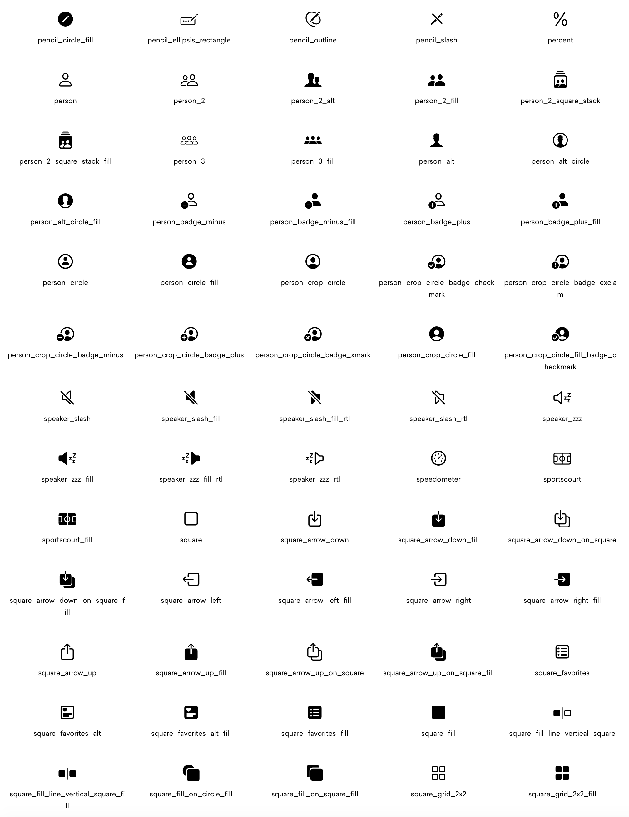 Some of Framework7 Icons v3
As you could know, Apple recently released SF Symbols - collection of official icons for using in iOS apps.
Official icons are really great designed and the collection is huge. We took most of them for reference and updated icons collection in new version of Framework7 Icons v3.
Whole Framework7 Icons collection has grown from ~380 icons to 1200+ icons! Most of icons (that came from SF library) are renamed as they appear in SF Symbols. It can be not very clear now but should be fine when get used to it, for example:
share>square_arrow_updelete>minusclose>xmarkadd>plus
This can be a breaking change, so take a look at new Framework7 Icons Cheatsheet and update your icons with new ones.
New Framework7 CLI v3
Framework7 CLI was also update with the following new features:
- Generated app templates updated to Framework7 v5
- Generated app templates updated to use Framework7 Icons v3
- Update cordova
backbuttonhandler. Now it will close opened modals (if available) or go back in navigation - Updated cordova-related scripts names, e.g.
build-cordova-dev->build-dev-cordova - Added alias
f7for CLI command. Now we can run it likef7 create --ui
CLI User Interface (--ui) updates:
- Added new Text Editor to custom build settings
- Added options to include/exclude Dark and Light themes in custom build
- Added ability to import project setting from JSON file
- Added ability to export project setting to JSON file
Deprecating Templates
All official Framework7 templates are deprecated now (will not be supported) in favour of Framework7 CLI which provides a much more flexible and up to date setup.
What Is Next?
That was just a brief overview of most significant changes.
There are also a lot of minor improvements and fixes across whole Framework7. For all changes list please refer to full v5 changelog which can also be helpful for migration from previous version.
As next steps it is recommended to check the following new and updated Framework7 v5 docs:
- Panel docs - for new Panel APIs and usage
- Layout Grid docs - for new responsive breakpoints reference
- Calendar docs - for new Internationalization based APIs
- Router Component docs - for all the new things about with mixins and custom components
- Custom Page Transitions docs - to know how to use and create own custom page transitions
- Navbar docs - for reference to new Navbar layout and new styles
- Text Editor docs - for new Rich Text Editor
- Swiper API - for new Swiper v5 API
- Framework7 Icons Cheatsheet - for new v3 icons
And docs in general:
- Framework7 Core documentation
- Framework7-Vue documentation
- Framework7-React documentation
- Framework7 Forum - the best place to get F7 support.
P.S.
If you love Framework7, please, support project by donating or pledging on Patreon: https://www.patreon.com/framework7
Your support means a lot for us!